Tuesday, December 8, 2009

My GIS Experience


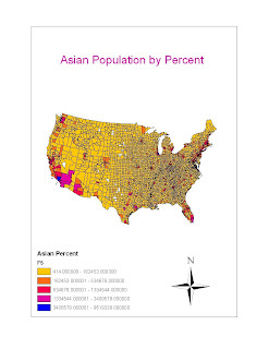
The Image to the left shows the Asian population by percent in the United States as depicted by the Census 2000. The picture shows that general distribution of Asian communities across America. It is easy to see the heaviest populated areas are those on the Eastern and Western Seaboards. Middle America's stark Asian population can also be seen from the colors on the mapped image. California, in particular, has the greatest population by percent of any other state in the United States.


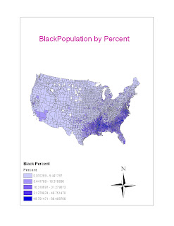
The image to the right shows the African American population by percent across the United States in reference to the Census 2000. The map is very interesting because it shows the specific concentration of Black communities across the Louisiana, Mississippi, Georgia, and Alabama regions, as well as the Virginias and other Southern states. Some counties within the specified regions have a percentage of in excess of 85% Black. In comparison, again, there are counties in middle america that do not even show up on the scale indicating an exceedingly low population by percentage.

The below image shows the Latino/Hispanic population by percent in the United States in reference to the Census 2000. Like the previous two mapped images, this image gives valuable insight to where the greatest and least percentages of Latino/Hispa
nic Americans reside. While the vast majority of the nation yields between 0 and 2% Latino/Hispanic residents, the Southwest holds the most population by percent than anywhere else in the US, with percentages capping out around the 40% margin.


My Census 2000 chloropleth map series were a yet another GIS experience. As the last project of the class, it was valuable to work through the ArcGIS program to find information pertaining to the population percentages by county across the nation. The maps themselves are could play a crucial role visualizing census data for infinite business and economic functions. While the mapped images above provide valuable insight, they are not the be-all-end-all of clorepleth maps. I personally used a 5 category breakdown to classify the different percentages, but for economical reviews, it would be necessary to go into further detail to review the populations more accurately.

Overall, my experience with ArcGIS and the Geography 7 geographic information systems has been positive. The learning curve is steep when dealing with the ArcGIS program, but it serves a valuable purpose to better understand such a crucial piece of data classification. ArcGIS can be used to see the extent of Fire Damage, or to see how populations of races vary among different counties in the United States. Throughout the labs, I have been able to experience just the rudimentary aspects of ArcGIS, but the labs have allowed me to see some of the various uses for GIS and just how much information can be gathered and visualized using ArcGIS.

Tuesday, November 24, 2009

Mapping the Station Fire in ArcGIS


The Station Fire was a fire that originated on Wednesday the 26th of August at around 3:30 p.m.. In its entirety the fire burned a total of 160,577 acres. The station fire destroyed 209 structures, including 89 homes. The wildfire coined its name from its origin. It began in Southern California's Angeles National Forest by U.S. Forest Service station on the Angeles Crest Highway.
The Station Fire burned over the span of three months; specifically from the 26 of August to the 16 of October. The fire, which is the 10th largest in California history claimed two firefighters lives when their fire engine plummeted off of the Angeles Crest Highway during the fire fight. The fire forced evacuations from the neighborhoods of La Canada Flintridge, Glendale, Acton, La Crescenta, Pasadena, Littlerock and Altadena, as well as the Sunland and Tujunga neighborhoods.
Not only were numerous cities evacuated, but roads were closed too. The roads were closed for numerous reasons, but the most common was for damage. Many roads unfortunately laid in the path of the blaze and were over taken. Major roads including Highway 2, Highway 39, N4, N3, and Highway 14 were closed for various periods of time during the extent of the fire. The map above shows the relation of the fire to the roads that were closed.
The assignment requires a map showing the extent of the fire as well as a thematic map displaying a specific aspect of the fire. I was able to incorporate both into one visual model with the above image which shows the fires growth from August 30th to September 2nd, as well as the roads that were caught in the blaze's path. Angeles Crest Highway was closed for the longest due to road damages even after the fire was contained. While most of the pavement stayed intact, road signs and debris flows left the road unusable for some time.
The Station Fire affected so much more than just road's and their availability. The road closures are just one aspect of numerous other issues that were associated the Station Fire. Other possibilities of thematic maps could have been debris flows, fire fuels, camp grounds destroyed by the fire, and so much more. I chose the road closures, because it is interesting to see what roads were closed and how that could have also affected evacuation plans. Maps like these are useful for such purposes, and also aid in the logistics for future developments.

Bibliography
Station Fire Update Sept . 27, 2009. InciWeb. Accessed 2009-09-28. Archived 2009-09-30.
"Station Fire Evening Update Aug. 31, 2009". InciWeb (United States Forest Service). 31 August 2009. Retrieved 3 September 2009.
"Firefighters Killed in 'Station Fire' Remembered". KTLA-TV (Channel 5). 1 September 2009. Retrieved 3 September 2009
"Station Fire." Inciweb.org. US Forest Service. Web.
"Angeles Forest officials use Station Fire to fine tune Twitter policy." SCPR.org. Web.

Monday, November 16, 2009

Digital Elevation Models

Slope DEM
Hillshade DEM
Aspect DEM
3D DEM

The chosen field of view for the Digital Elevation Models is a segment of the Sierra Nevada Mountain Range in Central California near Mount Whitney. I chose this area, because the Sierra Nevadas are among the tallest in the continental US and would yield a great DEM. All information was gathered using ArcGIS supplemented with information from the USGS Seamless server.

Extent Information:
Top: 36.9794444437 degrees
Left:-118.0908333333 degrees
Right: -117.873888888 degrees
Bottom: 36.790833326 degrees

Spatial Reference:
GCS North American 1983

Monday, November 9, 2009

Map Projections: The Real Deal

Maps are used by millions of people on a daily basis. It is easy, however, to take for granted what, exactly, the map user is looking at. The earth is a 3-Dimensional sphere, but maps, on the other hand, depict it in a planar 2-Dimensional format. A globe is not convenient to carry in ones pocket, and thus the map projection is necessary. The process of transposing a 3-Dimensional object onto a 2-Dimensional plane, nevertheless, comes with a fair share inaccuracies. Primitive map projections came with shining a light from the inside of a globe onto a wall, then tracing the features, thus creating a flat usable surface. Problems quickly arose, when obvious distortions in distances and shapes became prevalent. Efforts to preserve different aspects of globes such as distances, shapes, scale, and area gave birth to different mathematically based projections such as equal area, equidistant, and conformal map projections.

The GCS WGS 1984 and Mercator are both examples of conformal map projections. Conformal map projections preserve local angles. For example, a standard conformal map will have the equator in the middle. The further north and south towards the poles, however, the angles are not preserved and distortion is created, often increasing the size of land masses near the poles. The Conic and Sinusoidal maps are equidistant projections. Equidistant projections preserve distance from a standard point or line. Equidistant maps do not come in flat surfaces and are not ideal for daily use. They are used in finding accurate distances because there is little to no distortion at the polar regions. The final map projection used in these exercises are equal area map projections. The Mollweide and Hammer equal area projections satisfy the preservation of area on a 2-Dimensional surface.

No map projection is perfect. Each projection focuses on a specific aspect, but leaves other aspects immensely inaccurate. In general, Mercator projections are among the most common with user-centric programs such as Google Maps. Even though distortions are prominent at the poles, conformal projections are ideal for plotting routes and viewing land masses for directional purposes. Other map projections, such as equidistant maps are not necessarily visually friendly, but are ideal for plotting the actual distance or finding the shortest distance for navigation.

This exercise is perfect for examining the different types of map projections and what differentiates them. The dichotomy between conformal, equidistant, and equal area maps is necessary to understand. Understanding the key uses is equally as crucial. The general knowledge of depicting what projection is best to reference if asked to accurately determine the distance between two objects. In this case, a conformal map would not be best. Furthermore if, asked to evaluate the actual area of a continent near a polar region, a conformal would again not be they key to success. With this base knowledge of map projections, and a greater understanding of map projections are the next steps in truly adjusting to geographic information systems.

Equidistance Projections

Conic Equidistant Projection
Distance between Washington, D.C. and Kabul, Afghanistan: 6,983 miles
Sinusoidal Equidistant Projection
Distance between Washington, D.C. and Kabul, Afghanistan: 8,112 miles


Equal Area Projections


Mollweide Equal Area Projection

Distance between Washington, D.C. and
Kabul, Afghanistan: 8,072 miles


Hammer Equal Area Projection

Distance between Washington, D.C. and
Kabul, Afghanistan: 8,372 miles

Conformal Projections


Mercator Projection

Distance
between Washington, D.C. and Kabul, Afghanistan: 10,073 miles


GCS WGS 1984 Mercator Projection

Distance between Washington, D.C. and Kabul, Afghanistan: 8,087 miles

Tuesday, November 3, 2009

The ArcGIS Experience

It comes as little surprise that the program used by the United States Geological Survey to create map-centric maps, is a complex program. Just as Professor Shin explained, ArcGIS has a steep learning curve, and I am thankful I was not the guy who shows up at his office frustrated to tears. Although there were some parts where I was tempted to shed a few frustration tears, I was able to do without. I can liken my first experience with ArcGIS to trying to edit a photo in Photoshop with absolutely no tutorial. A program as advanced as ArcGIS is inevitable complex, but with good reason.

ArcGIS is a map-centric interface that is far more involved that my previous maps software experience with Google's "My Maps" user-centric interface. ArcGIS is, as previously stated, a map-centric software. Map-centric maps cannot be editted by the general public for the general public like Google Maps, thus increasing the the validity of ArcGIS maps. ArcGIS, too, is a more professional system of surveying land and categorizing regions. The devices that were used just in this lab show the power ArcGIS has. The system allows the user to gather pertinent information like what schools, residences and businesses are within the noise contour of an airport. It also allowed the user to understand population densities and even create a new route to and from an Airport.

ArgGIS is a professional system that is trusted in the geographic community. Besides the dificulty trying to remote access a PC through a MAC computer, the only real pitfall is the program's complexity. With the utility of the ArcTutorial, however, the program was explained to the point where a person who is not very technologically savvy, such as myself, was able to create maps and graphics of regions. Even though the program requires a decent amount of trial and error, it is still user friendly.

After this lab, I feel comfortable with ArcGIS. It only required a few journeys through the ArcTutorial for me to understand the uses of ArcGIS and how they pertained to Geography 7. Unfortunately, there were still a couple areas that my computer would simply not let me preform. The two areas that caused confusion came with the population density and the last red box that was to cover the airport area on the county map. Besides those two struggles, my experience with ArcGIS was successful and has given me a greater knowledge and appreciation of geographic systems.

Monday, October 19, 2009

Neogeography Mash-up

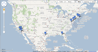
With the utility of Google Maps, the hometowns for each defensive player on the San Diego Chargers can be viewed on this mash-up. View the actual "Where Are the Chargers From" mashup here.

Neogeography, which literally means new geography, is defined as a commonly applied usage of geographic tools and techniques used for personal and community services or for utilization by a non expert group of users. GIS, or Graphic Information Systems, has been used professionally as the mainframe for the United States government's mapping industry. USGS topographic maps are used professionally for reference.

Neogeography, however, has opened the doors to the public. Neogeographic maps, such as Google Maps have moved maps into the public sector. Now it is possible for civilians and amateurs to use maps for personal interests. Neogeography mash-ups do bring controversy, however. Problems such as accuracy arise. Since the vast majority of mash-up users are amateurs the validity of certain maps can come into question. USGS maps are classified as map-centric which means they are used strictly for geographic information. Mash-ups, however, are user-centric which means anyone and everyone can create a map for personal interests. For my example, there is no governing source to see if the towns listed are in fact actually accurate.

Neogeography is relatively new and is quite useful. Though it is not necessarily on the professional standard, its uses can even be more practical than USGS maps in many cases. Neogeography is still budding and making its technological advances. Thus, making new mapping techniques more user friendly.

Monday, October 12, 2009

Quadrangle- Beverly Hills

1. What is the name of the quadrangle?

Beverly Hills Quadrangle

2. What are the names of the adjacent quadrangles?

Canoga Park, Van Nuys, Burbank, Topanga, Hollywood, Venice, and Inglewood.

3. When was the quadrangle first created?

1966

4. What datum was used to create your map?

North American Datum of 1927 and North American Datum of 1983

5. What is the scale of the map?

1:24,000

6. At the above scale, answer the following:

a) 5 centimeters on the map is equivalent to how many meters on the ground?

1200 m

b) 5 inches on the map is equivalent to how many miles on the ground?

1.89 mi

c) one mile on the ground is equivalent to how many inches on the map?

2.64 in

d) three kilometers on the ground is equivalent to how many centimeters on the map?

12.5 cm

7. What is the contour interval on your map?

20 ft

8. What are the approximate geographic coordinates in both degrees/minutes/seconds and decimal degrees of:

a) the Public Affairs Building; Lat- 34 deg 4'24" N (34.073 deg N) Lon- 118 deg 25'52" W (118.065 deg W)

b) the tip of Santa Monica pier; Lat- 34 deg 0'30" N (34.0083 deg N) Lon- 118 deg 29'50" W (118.5251 W)

c) the Upper Franklin Canyon Reservoir; Lat- 34 deg 7'10" N (34.0091 deg N) Lon- 118 deg 24'28" (118.4178 W)

9. What is the approximate elevation in both feet and meters of:

a) Greystone Mansion (in Greystone Park); 581 ft/177 m

b) Woodlawn Cemetery; 98 ft/ 30 m

c) Crestwood Hills Park; 636 ft/ 194 ft

10. What is the UTM zone of the map? UTM Zone 11

11. What are the UTM coordinates for the lower left corner of your map? 3763 and 362

12. How many square meters are contained within each cell (square) of the UTM gridlines? 1,000,000 square meters

13. Obtain elevation measurements, from west to east along the UTM northing 3771000, where the eastings of the

UTM grid intersect the northing. Create an elevation profile using these measurements in Excel (hint: create a line

chart). Figure out how to label the elevation values to the two measurements on campus. Insert your elevation profile as a graphic in your blog.

.

14. What is the magnetic declination of the map?

14 degrees East

15. In which direction does water flow in the intermittent stream between the 405 freeway and Stone Canyon

Reservoir?

North to South

16. Crop out (i.e., cut and paste) UCLA from the map and include it as a graphic on your blog.


Tuesday, September 29, 2009

Station Fire Map

This map shows the affected areas of the California Station Fire only a few days after it first started. The image was mapped by the USDA Forest Service MODIS Active Fire Mapping System. The enormous smoke cloud that the fire emitted was visible from almost any spot in the Southern California area. This map helps visualize just how far the fire reached and what was causing the enormous smoke cloud that was visible from space.

McDonald's Across America

This map shows all of the 13,000 McDonald's fast food restaurants in the Continental United States. This map was created by Stephen Von Worley at weathersealed.com. Each light represents one McDonald's restaurant and the glowing area shows the client base each one reaches. According to the map, the farthest point anyone in the United States could be away from a McDonald's is 150 miles. Another interesting aspect of the map is you can clearly see the outline of the United States, you can clearly identify where the major cities are, and even identify heavily travelled roads, because of the density of the lights.

Orange County Surf Spots


This map represents some of the highest rated surf spots along the Orange County coastline. This surf-spot map comes from thesurfingsite.com which is a site devoted to spreading the knowledge of surfing to beginners. The convenience of this map is the fact that it shows where the surf-spots are located. The names of surf spots are rarely the actual beach name, so a map that shows the surf-spot's names is really convenient for the surf enthusiast.